Case Study - Pasta Amore
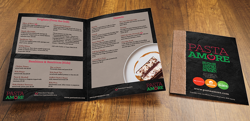
Completed as a case study for SNHU’s Desktop Publishing. The Pasta Amore menu was designed according to Pasta Amore’s Branding Style Guide that was provided including colors, fonts and a logo. A burlap overlay on the margin of the left side of the menu cover showcases images of fresh Italian ingredients used in the restaurant that are featured in many of the menu offerings. The logo is placed at the exact center of the cover with the website address on Cannoli Klinic Slab font. An image of a popular dish is featured in the top right corner of the cover. The contact information for the restaurant is placed in the center on the bottom of the cover in Cannoli Klinic Slab. The interior pages feature the same back slate textured background. Each section is inside a 77% opacity Cannoli rectangle. The section header is in Marinara Red Klinic Slab. Menu selections are listed in two columns. The text was spaced so that it was easy to read the menu items. According to Landa, to ensure readability, use left-justification of justified text type alignments. Break text into manageable chunks. Choose typefaces with larger x-heights,” (2022, 54). Item names are Wine Goudy Old Style and description items are black Goudy Old Style to improve readability. The tomato ‘O’ graphic has been extracted from the logo and applied next to certain specialty menu items that. the logo is placed on the outer bottom corner of the menu and the website in Cannoli Klinic Slab is in the opposite corner. Images of menu selections appear in the corner of every right sided page. The back cover features the logo with a QR code to the Delivery menu as well as the Delivery apps that the restaurant features. All pieces were designed with Adobe Illustrator and Adobe Photoshop.